The Making of a Poppy Pattern

Lately I've been enjoying the time-consuming process of creating repeating patterns out of my watercolor paintings. I'd like to share the process of creating my most recent pattern with you, starting with an arguing couple in a public park and ending in a poppy pattern.

On a really beautiful and sunny day in Reykjavik, I walked to the nearby botanical garden to paint. I was going to paint some small blue flowers, but an annoying arguing couple decided that the botanical garden park bench would be a great place to work out their relationship issues. I moved away from their argument and found a flower that matched my shirt. Serendipity? Yes.

Then, a few weeks later, I started to paint a pattern idea in my sketchbook while sitting at a lovely cafe in the botanical garden with an illustrator friend who was here for a visit. I just loved how the reddish-orange in my portable little watercolor set was already the perfect poppy color, so it was easy to start a pattern. I referenced my earlier painting as I made up this winding pattern.

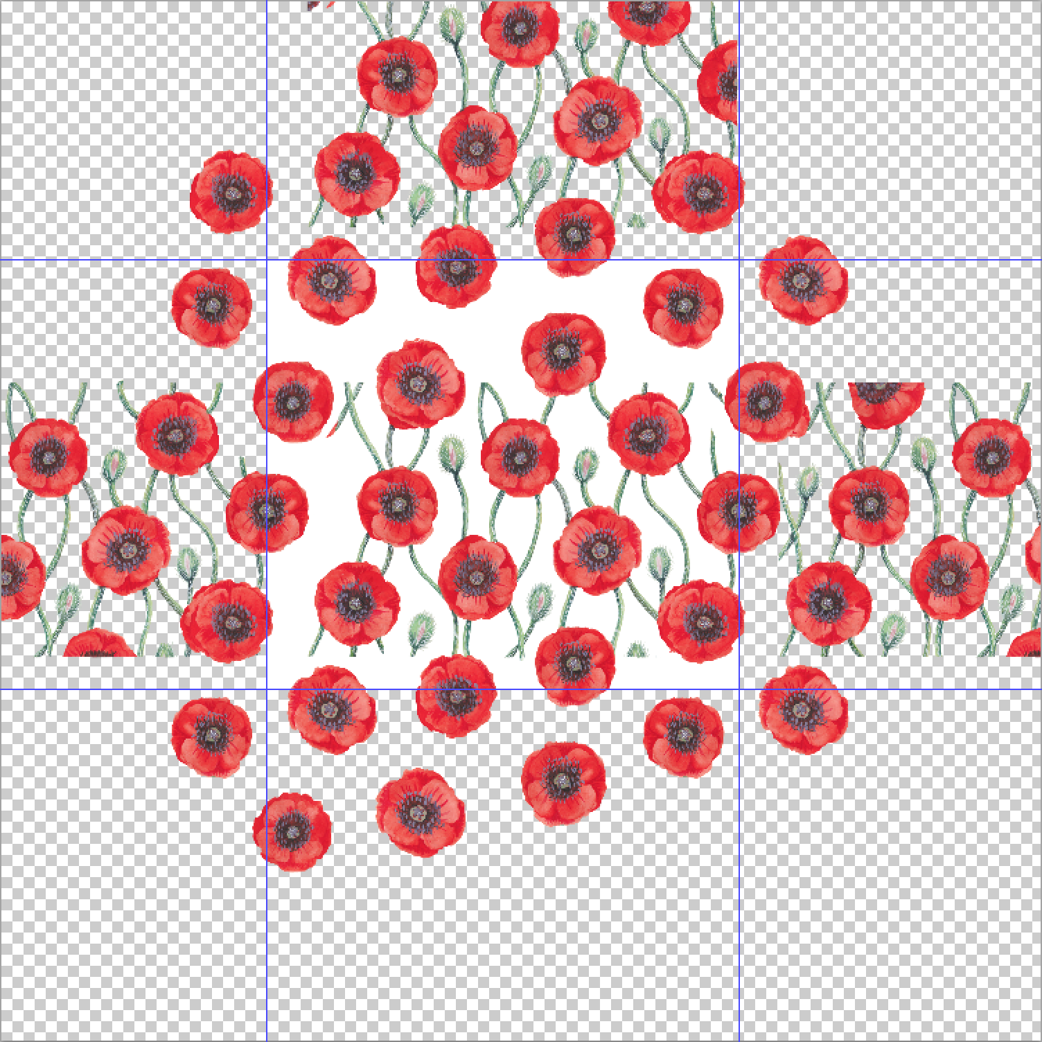
Of course, this painted pattern idea was not a repeating pattern, and it would require some work to make it into one. I scanned the painting and started to work in photoshop, creating a grid and first and foremost figuring out where the flowers needed to be to make a nice repeat. I erased the paper background because the shading and texture in paper is not easy to make look seamless in a repeat pattern.

The way I was taught to create patterns in photoshop is by creating a grid of sorts. Really, any rectangle or square will do. And then make sure that the edges line up. The top needs to line up with the bottom of that rectangle and the right side needs to line up with the left side. So the focus is on the edges, not the middle. But for a floral pattern like this one, a visual balance is really important. I needed to be sure that the flowers were seemingly equidistant from each other. I didn't want one flower to take your focus from the others. I wanted it to appear evenly spread out.

I cut out some of the flowers and repeated them on individual photoshop layers and created these guidelines to see where a natural repeat would be. Then I created my rectangle on a separate layer. Then I began the long and tedious process of copying and dragging items from one edge to the other, along with the rectangle, so I can be sure these edges line up perfectly. I started with the flowers and then I needed to make the stems and buds match up on the edges and appear evenly distributed throughout the pattern. This is not a quick process, but if you are someone who enjoys tinkering, this is quite enjoyable.

When I feel like I'm getting close, I test my pattern to see how well it repeats. I create a duplicate document, crop the image at the rectangle, flatten the image, select the image, and define it as a pattern (Edit > Define Pattern...). Then I can open a new document and make it large and fill it with my newly created pattern. Any big mistakes will be obvious immediately, and the pattern can be closely inspected so you can tell where an improvement might need to be made.

Click on one of the 5 thumbnail images below to page through the process in a lightbox.

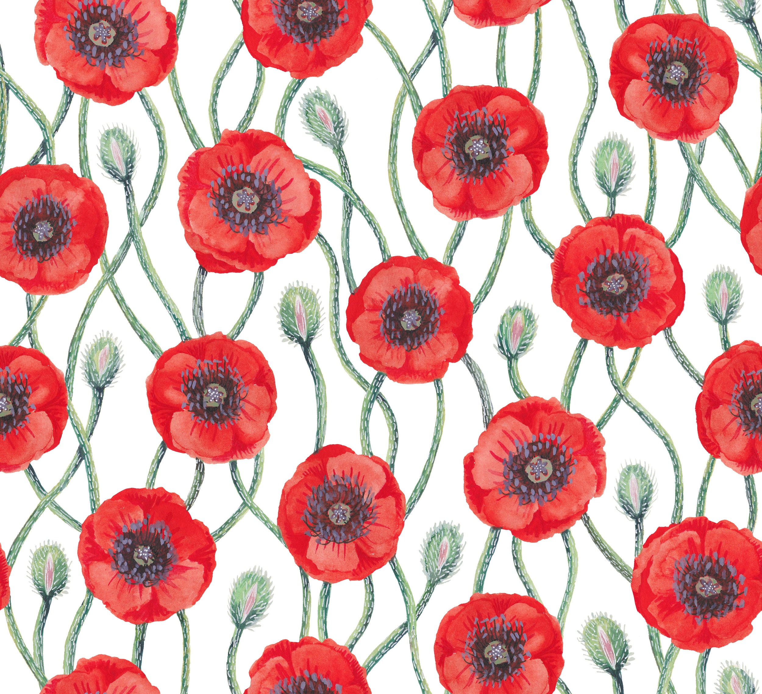
Before wrapping up my pattern, I wanted it to have the same sort of colors as my original painting. Scanning doesn't always give the most accurate colors, so this kind of color adjustment is almost always required. I adjusted the poppy color from the red of the scan to the reddish-orange of the painting. And I added an off-white background in place of my white rectangle. The background appeared flat to me, so I added noise to the background using a filter. This helped the background to better pair with the paper texture of the painting.

I am really happy with the result. I hope you enjoyed seeing a bit of the process! Cheers!

April Project: Day 20

Happy Monday! Today was a windy day, so I stayed in and worked from home. I created a repeating pattern from the florals I painted on Day 8. Here is how it turned out. I'm pretty pleased with it. :)

This is what the process looks like before I define the pattern. I have to make sure the edges all line up properly so the pattern has a nice repeat.

I'll be back tomorrow with something new to share. Have a great rest of your day! :)

April Project: Day 18

Hello, lovely friends! Today I had a very full day of sight-seeing and hiking. I came home late and gave myself a short amount of time (one hour) to put some plants into those cups. I consider them a work in progress, but this was as far as I got today. I hope you enjoy them!

I will have a bit more time tomorrow, so perhaps I'll do something completely different? Who knows. But I'll be sure to be back tomorrow to share whatever I end up creating! :)

April Project: Day 16

Hello, and Happy Thursday! Today I played with gouache and painted some teacups and coffee cups and mugs and so on. Basically, containers with a single handle. Then I added some linework digitally. I want to make a teacup garden, so I'm thinking that I'll work next on adding little plants growing out of the cups... Yes, I think that would be very fun, indeed!

I'll be back tomorrow with some more fun, so have a great Friday and check back tomorrow! :)

April Project: Day 15

Happy Wednesday! Today I played with green gouache and metallic gold ink. I made a pattern, which I think is very lovely and would be great as a paper, or as a surface design for products if it could be foiled with gold foil or printed with metallic ink. I'll be back tomorrow to play more. Have a great rest of your day!

April Project: Day 10

Happy Friday, friends! Today was a windy and chilly day in Reykjavik. I got to spend a few hours with some of my Norwegian relatives who flew in today for a karate competition happening in town tomorrow. It was so fun to see them, speak some Norwegian, and show them around a bit. Later today I took down my work that was on display for a month at Mokka Kaffi. It was fun to have my paintings and drawings up for so long, and I look forward to perhaps someday having my own show somewhere in town.

I didn't give myself as much time to play today as yesterday, but I still managed to doodle and make some patterns. I had a couple scraps in my studio of my favorite paper (300 lb. Fabriano Hot Press Watercolor Paper in Bright White) that I had painted yellow and blue, so I painted one with gouache and drew on the yellow piece with shiny white ink and graphite. I haven't used graphite in combination with white ink like this before, but I liked the result. It was a fun way to make the shiny ink pop from the background, adding a little more dimension to it.

I'm looking forward to putting on pajamas and curling up in a blanket for the rest of the evening, listening to the weather get worse and worse. It is already lightly snowing and the wind is howling outside, but it is supposed to get worse later on. Inside is the place to be. Perhaps I'll bake some delicious cookies, too. That sounds good to me!

I'll be back tomorrow with something playful and new. Have a great weekend, everyone! :)

April Project: Day 7

I worked for a while on making the green vessels into a wall-worthy piece, completing any of the vases that went off the edge of the scrap of paper I was painting on. I turned it into a repeating pattern, which I really like. The print is now available in my Society 6 shop, and there is free shipping right now on some items, including prints, so feel free to check it out. I'll make more color options available in time. 

To finish off these vases, I added a few to fill in the gaps. I drew a mermaid on a vase, and I fell in love with her.

7_mermaid_vessel.jpg

I decided to make her into her own piece. I didn't have much time to devote to her, but this is where she's at. I'd love to play with surrounding her with coral and fish...

Thanks for tuning in! I'll have something new to share tomorrow. :)

Pablo Picatsso Takes a Nap

It's that time again, when I've made a pattern to suit a contest theme. I really enjoy the challenge of it, and since I already had a pattern of napping kitties, I decided to modify it to fit the "Cubist Cats" theme. I dressed the cat up in some Picasso style stripes and beret, added some colorful paintbrushes and palettes, and even got the shirt a little messy in the process. The result? I think it's a pretty cute cubist cat pattern. I think it would make an excellent artist's smock, and it would be a fun material for a craft kit of some kind. Well, I'll let you know when voting opens, and if you like my design, please vote for me! Thanks!

Fairies, Flowers, and Lots of Cats

For the past few days I've been working on some new patterns, so I thought I'd share them with you. Here are a few that I especially like. I've been on a garden fairy kick lately. Could it be the darkness of winter in Iceland, or the lack of flowers in my life? Maybe. I've just had so much fun making these repeating patterns. Surely there has got to be a use for these somewhere out there!

Before my garden fairies, I did some digital illustrations based on my cat, Eyja. She finds the cutest poses as she naps and plays and wants her belly rubbed, so I decided to make a repeating pattern of her poses. Here is how that turned out.

And because I felt like it, I made some variations and matching plaids. Plaids are awesome, and so are cats, so I thought if I combined them into matching sets, that would be super awesome! 

Well, I hope you have a great rest of your week! Cheers!

Holiday Header.jpg

Time for Ornaments

I decided to enter another competition, and this time it is for wrapping paper. With the season of gift giving and wrapping just around the corner, it was fun to work on. Right now in Reykjavik, the city is preparing for Christmas and putting up the garland and lights along the main street. I love how cosy this city gets. I'll share photos when it's up and ready for me to photograph.

So, the theme this time was ornaments, and I decided to go eclectic and crafty, with a rougher watercolor paper texture and a hand-done look. I had a very hard time deciding what color to have the background be. Perhaps you could help me decide? I like the brown, but I thought some other colors looked good, too.

Dia de los Muertos

I just decided, on a whim, to enter this week's fabric design contest at Spoonflower, a cool site where artists can upload designs and people can purchase those designs as different types of fabric, wallpaper, or gift wrap! Friends of mine have competed in these weekly competitions before, and I check in now and again and vote for my favorites, too. The topic for this week's competition was Calaveras, the sugar skulls made for the Day of the Dead in Mexico. I spent a few hours coming up with my design, and here it is. I believe voting opens tomorrow and ends on October 29th, so if you want to pop on over and vote for me, that would be swell!

Damask_de_los_Muertos.png

Update: I was in the TOP TEN!!!! Hooray! So my pattern is on the website in the winner's circle, and also my design is now for sale as fabric! Check out my Spoonflower shop! Thanks to everyone who voted for me!!!! :)