Well, today is the eighth day of my April Project. I thought I'd get back to basics, abandon my computer for a bit, and pull out some gouache paints. I kept it simple and painted some floral designs, which I think I'll turn into a pattern later. Turn in tomorrow for another playful something! :)

April Project: Day 7
I worked for a while on making the green vessels into a wall-worthy piece, completing any of the vases that went off the edge of the scrap of paper I was painting on. I turned it into a repeating pattern, which I really like. The print is now available in my Society 6 shop, and there is free shipping right now on some items, including prints, so feel free to check it out. I'll make more color options available in time.
To finish off these vases, I added a few to fill in the gaps. I drew a mermaid on a vase, and I fell in love with her.

I decided to make her into her own piece. I didn't have much time to devote to her, but this is where she's at. I'd love to play with surrounding her with coral and fish...
Thanks for tuning in! I'll have something new to share tomorrow. :)

April Project: Day 6
So, yesterday I had fun painting and decorating a variety of vases and vessels. Today I played around with photoshop, changing colors and making various adjustments. Here are some of the resulting variations. Click on any image below to page through these variations on a theme. Which do you like best?


Tomorrow I think I will start fresh with something new. I don't yet know what, but it will be fun!

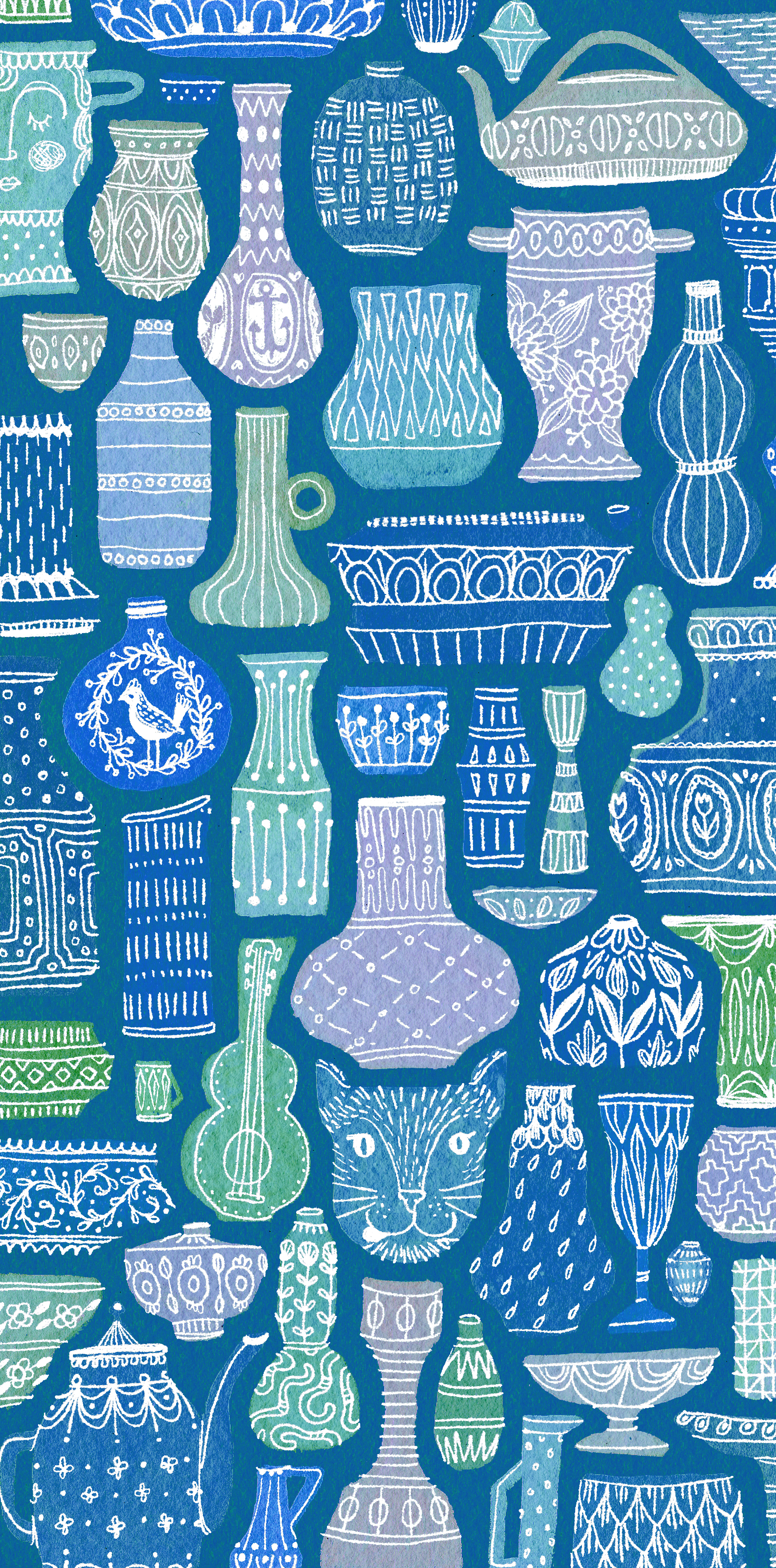
April Project: Day 5
After yesterdays painted portrait, I decided to loosen up and start painting without a plan. The result? This.
I must really love vases and vessels and teapots and footed bowls because those were the shapes I started to paint. I nested them into the negative spaces between the others, and the resulting painting looks like it wants to be a pattern.
I scanned the painting and added rough white linework digitally. This is how it turned out.
This Easter I painted and decorated vessels, not eggs. It was really fun to play and create without a plan. :) I hope you have a great day and I'll be back tomorrow to play and share more art with you. Perhaps I'll even branch out into different color palettes?

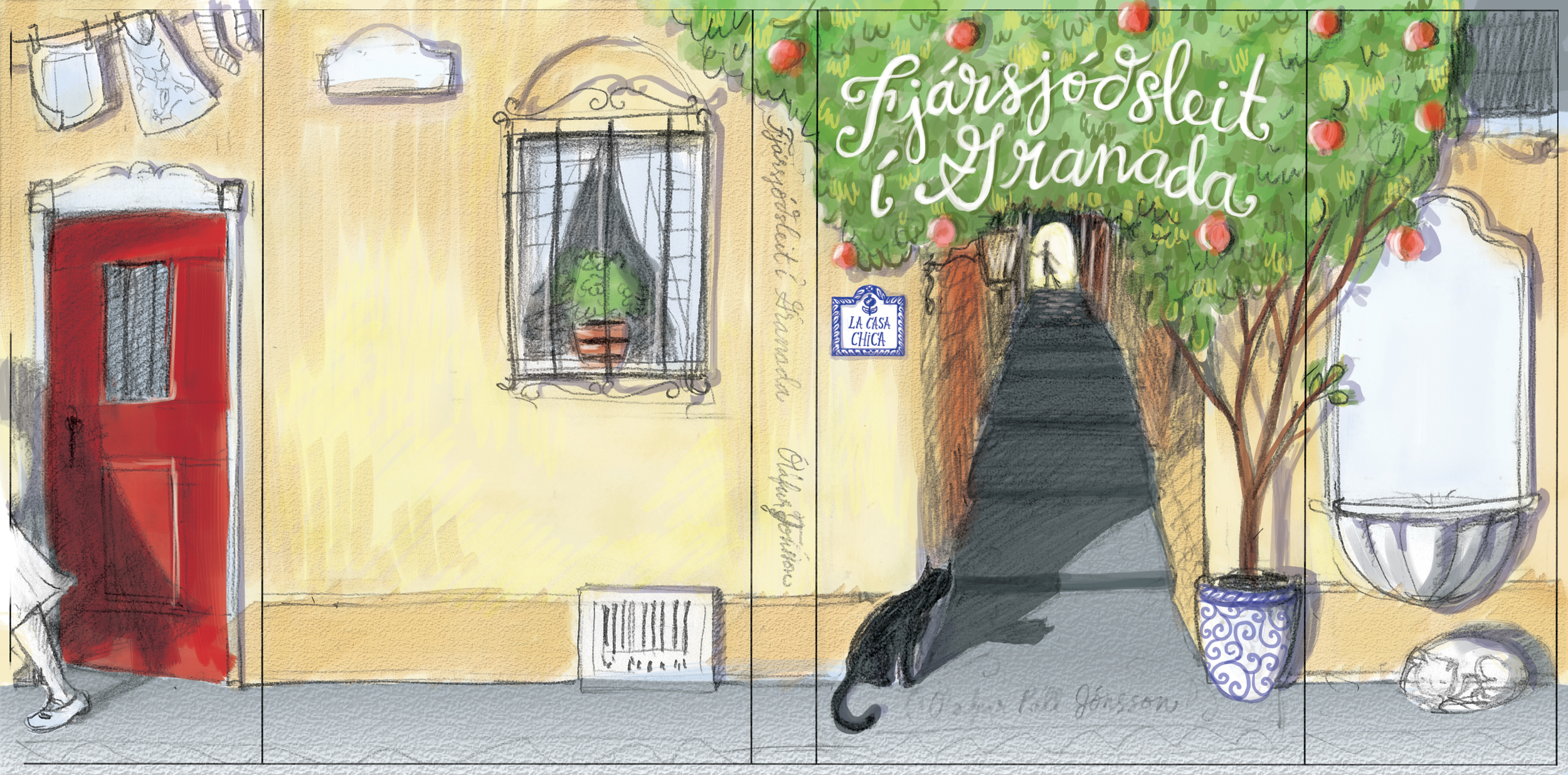
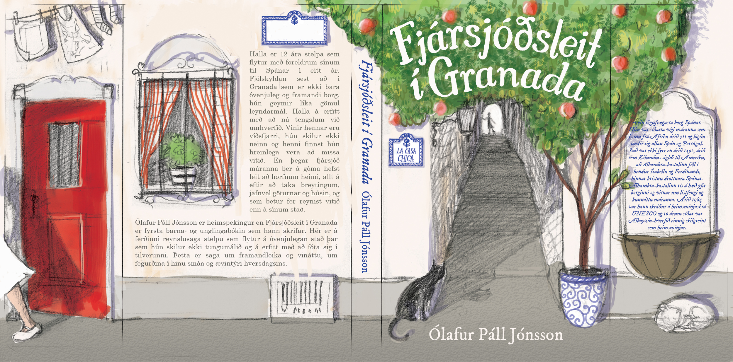
Treasure Hunt in Granada
One of the highlights of this past year was illustrating the cover of a book in Icelandic by Ólafur Páll Jónsson. It is a middle-grade/young adult book about his daughter's experience when they lived in Granada, Spain when he was on sabbatical. The title of the book means Treasure Hunt in Granada, and with the cover I tried to evoke a feeling of adventure and mystery, while also showing off the charming style and distinctive mosaic pathways of Granada.
I met with the author and his friend, Einar, for the first time on a particularly blustery and rainy Monday here in Reykjavik. I had taken my umbrella with me, which only shortly after leaving the apartment I realized was a terrible idea. My umbrella, though adorable, could not help shield me from the wind and rain, but it could propel me in any direction like a Mary Poppins gone wrong. I closed it and carried it anyway, not wanting to turn back and be in this weather any longer than I had to. I had no idea what the author looked like, so I wondered how I would find him and how he would find me. We were meeting around lunchtime at the University of Iceland's cafeteria, which as you can imagine is a busy time of day, packed with people, many of whom look like nordic relatives of mine. I found myself a seat at a table, and after only a few moments, a man approached and said, "You must be Kirsten. I'm Ólafur." I was amazed. How did he know? "I saw your umbrella and I knew you couldn't be from Iceland." Ha, ha, ha! Yes, a rookie mistake really helped me stand out.
As we talked about the project, I took notes and got many ideas that I was excited to sketch. Within a couple days, I had send multiple thumbnail concept sketches for cover ideas.


The chosen sketch for the cover design was the first one, though they really liked them all, and the fourth sketch was a close second choice. Those two were also my favorite sketches, and I agreed wholeheartedly with their decision.
<tangent> Different mediums make me create things differently. That sounds like an obvious point, but I mean that the medium dictates how I create, not just what the finished product will look like. And though I like my usual pen and ink with watercolor, I feel that medium makes me tighten up and the final pieces often lose a little bit of the life and character that the loose sketches had. I really like my sketches, and the rough quality and spontaneity in them. Likewise, lately I have found that I feel much freer when I'm working digitally. I can more easily stay loose and make bold marks without fear. This medium is often so true to my sketching esthetic that I am super happy with the perfectly imperfect result. </tangent>
Because I liked the energy and loose quality of the sketch, I decided to do something I had not done before on a project this big. I decided I would use graphite instead of my usual ink to do my linework, and I would color this illustration digitally.
I enlarged the thumbnail sketch and added some more detail.


Then I decided to do some color studies, digitally of course.
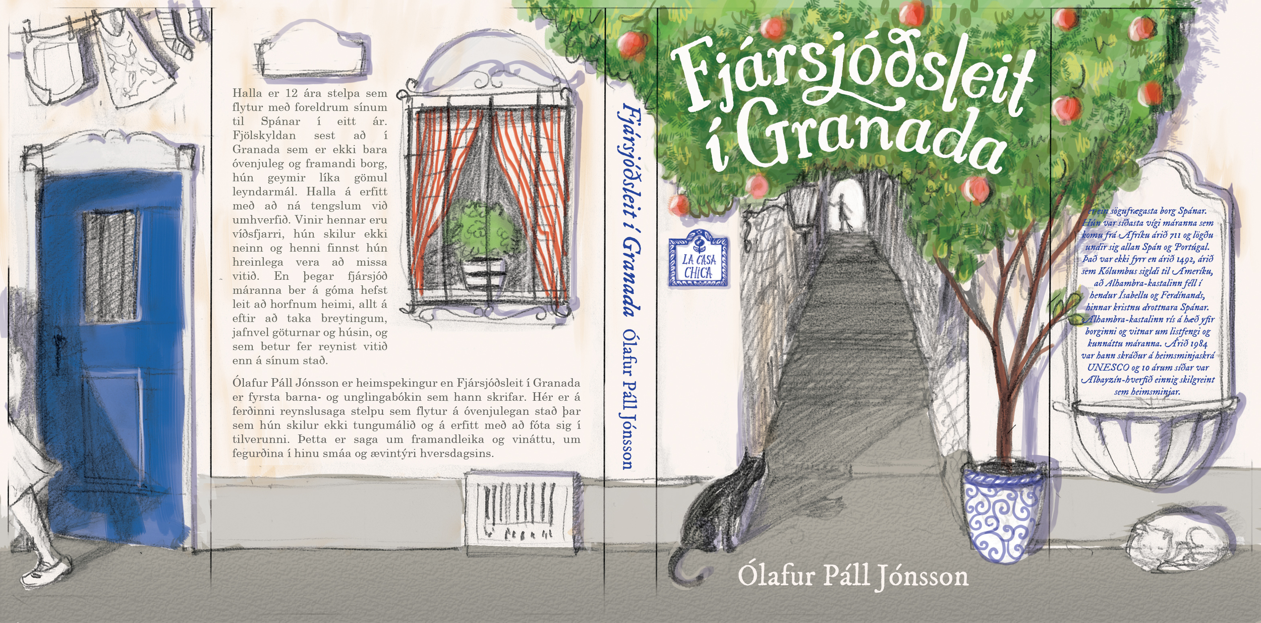
Then I created my final "sketch," which would be the drawing I would use as my final linework.
Then I adjusted levels and saturation and started to add color. Here is what the process was like.

Since many of you are unlikely to have a copy of this book in hand, here are some details that I really like. Click on any of the squares below to page through them.


I was thrilled when I got to hold my sample printed copy! Now, if only I could wrap my head around Icelandic! I have considered painstakingly going through this book with a dictionary. I am already a slow reader as it is, so I would hate to think how long that would take me! Well, I hope those who can read it enjoy it.


I hope you enjoyed this look into the process of putting this book cover together. Cheers!
